
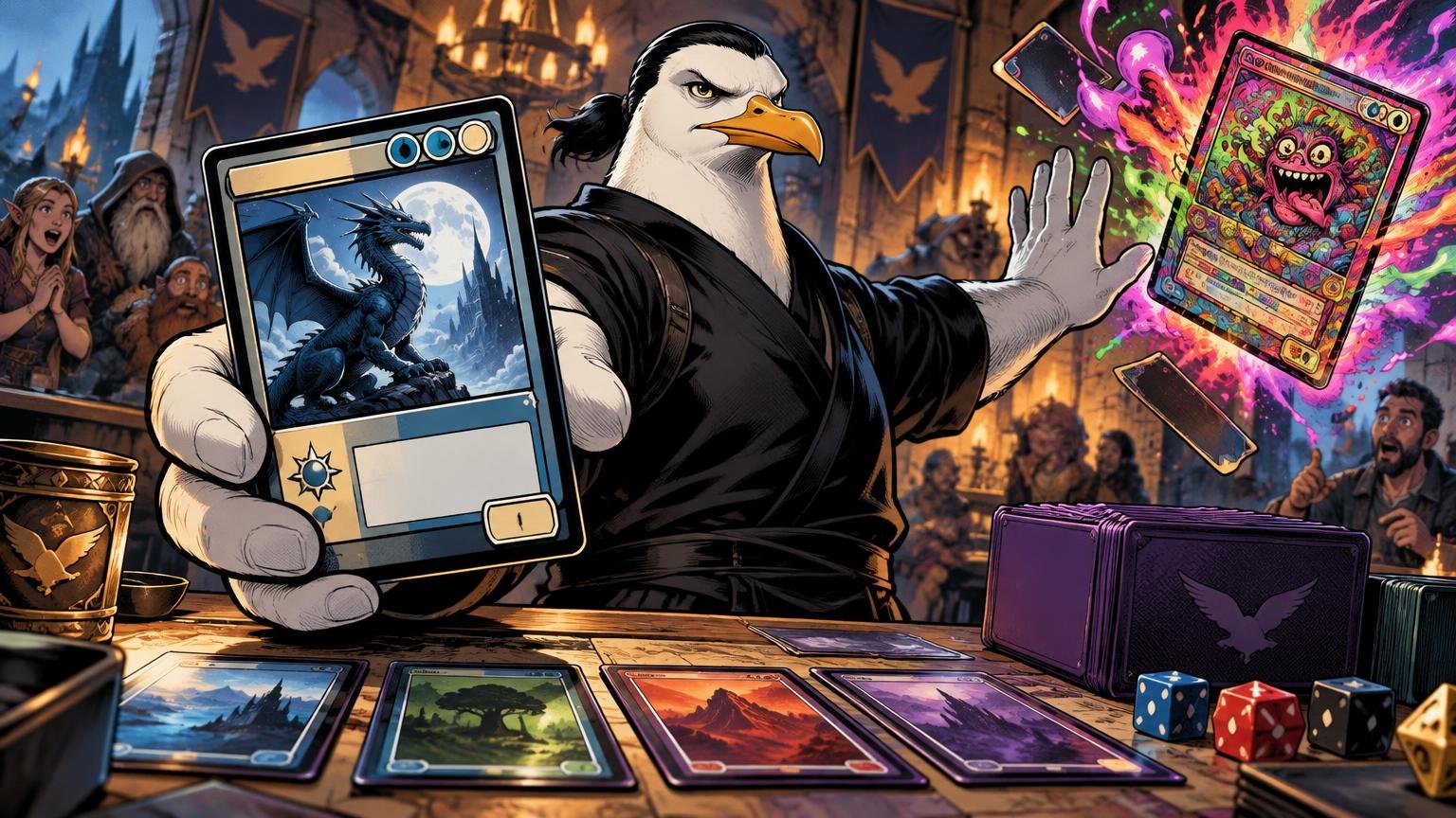
TLDR: Good custom MTG proxy art design changes the atmosphere without sabotaging the information. Keep the official card name prominent, preserve familiar locations for mana cost and rules text, use consistent frames, and test every card at actual size. The theme may enter dramatically. The opponent should not need binoculars.
Custom MTG proxy art design succeeds when a player can admire the card and identify it quickly. Start with a repeatable visual system rather than decorating 100 cards independently. Art direction, frame style, typography, color cues, and icon placement should be consistent across the deck. Names, costs, types, rules, and important numbers remain operational equipment.
First decide whether it is a proxy or a custom card
An alternate-art proxy represents an existing Magic card. Its illustration, frame, title treatment, and flavor may change, but the underlying game object does not. A wholly custom casual card introduces original mechanics, costs, types, or statistics. That is a separate mission involving rules templating, balance, playtesting, and explicit table approval.
Keep this distinction visible in the design brief. For an existing-card proxy, record the official card name, mana cost, type line, Oracle rules text, and any relevant power, toughness, loyalty, defense, or other game value. Magic’s rules treat these as functional card information, not decorative suggestions.
A custom card needs all of that plus scrutiny of what the new abilities actually mean. Attractive artwork cannot rescue ambiguous rules text. I once attempted to negotiate with an ability that had three replacement effects and no punctuation. There were no survivors. The semicolon remains at large.
Build a visual bible before making the deck
A cohesive proxy deck does not require every card to look identical. It requires shared rules. Before commissioning art or opening a design tool, create a one-page visual bible covering the following decisions:
- Theme: define the setting, mood, era, or visual story in one sentence.
- Art direction: specify illustration style, lighting, level of detail, and prohibited motifs.
- Frame family: choose one main frame treatment and limited variants for mechanically distinct card types.
- Palette: assign recurring colors for card identity, factions, or deck roles without relying on color alone.
- Typography: choose readable fonts for names, types, and rules text; restrict decorative fonts to large display text.
- Icons: establish where set symbols, decorative emblems, and status markers may appear.
- Cropping: define how much room figures, faces, weapons, and other focal subjects need around the card interface.
Consistency reduces the amount of visual decoding demanded from the table. A gothic deck can have cathedral lands, stained-glass removal, and commanders framed like forbidden saints. It does not need seven different title positions because each card experienced an individual artistic awakening.
Wizards described similar priorities in its historical discussion of the Magic frame: legible titles, contrast, clear power and toughness presentation, and frames that support the art rather than fight it. Wizards’ discussion of Magic card frames remains a useful design reference, even though official frames have continued to evolve.
Preserve the gameplay map
Players learn where information lives. They glance near the top for the name and mana cost, below the illustration for the type line, through the lower box for abilities, and toward the bottom for relevant values. Custom art may redraw the perimeter, but moving every control creates unnecessary search time.
| Card element | Recommended treatment | Reason |
|---|---|---|
| Official name | Large, high-contrast, and near the top | Allows immediate identification and clear table communication |
| Mana cost | Visible in a consistent upper area | Supports quick casting and color checks |
| Type line | Separated from rules text | Clarifies card types and subtypes |
| Rules text | Plain font, sufficient spacing, quiet background | Keeps abilities readable at card size |
| Important values | Use a consistent, isolated location | Makes power, toughness, loyalty, or defense easy to scan |
| Flavor and jokes | Visually subordinate | Prevents comedy from impersonating game text |
Familiar placement matters most in complicated board states. If six permanents are active, the reader should not have to investigate whether a glowing number in the moon is power, mana value, or the artist’s apartment number. Isolation and consistent placement make values faster to understand.
Keep the official name and rules accessible
A thematic title can be excellent. “The Tax Collector of the Black Marsh” may fit your deck better than the printed character name. Use it as a display title, then show the official card name directly beneath it or in a secondary title bar. Official alternate treatments have used secondary naming to preserve the underlying Oracle name, and Magic’s rules rely on Oracle card names for card-name choices.
Do not make opponents memorize a private translation dictionary. If someone asks what the card is, the answer should already be printed on it.
Use the current Oracle wording for the represented card rather than automatically copying text from an old printing. Oracle text is the authoritative rules wording, while reminder text, flavor text, and rules text serve different purposes. Decorative icons placed inside the text box do not normally acquire gameplay meaning because they look important.
When space becomes tight, remove optional flavor before shrinking functional text into a hostage note. Shorten an alternate title, simplify ornament, or adjust the art crop before compressing the actual rules.
Use color as reinforcement, not the only signal
A frame’s decorative hue does not determine a Magic card’s color. Defined characteristics such as mana cost and color indicators do that rules work. Your design should therefore retain accurate mana symbols and any relevant indicators instead of asking a purple fog effect to communicate everything.
Build redundant cues. A black card might combine correct mana symbols, a stable title treatment, a recurring border pattern, and a palette associated with that part of the deck. Artifact cards might receive a distinct frame texture. Multicolored cards can retain visible costs and a consistent hybrid or gold treatment. The exact aesthetic is flexible; the information should not depend on hue alone.
For a practical contrast benchmark, the W3C guidance on minimum text contrast uses a 4.5:1 ratio for normal web text and explains why hue alone is not enough for reliable readability. That is not a physical trading-card printing specification, but it is a useful warning system when choosing text and background colors.
Visual choices that slow the game
Full-art and borderless designs are not automatically confusing. They become confusing when the art occupies the same visual territory as functional information. Watch for these common breaches of the perimeter:
- Busy artwork visible directly behind rules text.
- White text crossing both bright highlights and dark shadows.
- Every card type using a different frame and information layout.
- Alternate joke titles replacing official names entirely.
- Illustrated symbols that resemble mana, counters, or keyword icons.
- Important values hidden inside decorative corners.
- Rules text set in condensed, script, or all-capital display fonts.
- Art containing signs, labels, or inscriptions that compete with the actual text box.
- Low-contrast borders that make separate information areas blend together.
If the artwork is too busy for overlaid text, give the text a solid or translucent panel with enough visual separation. The art loses a small amount of territory. It will recover. Art is resilient.
The frame should also remain consistent enough to signal categories. Creatures may share one lower stat treatment, planeswalkers another, and lands a quieter rules area. Variation should correspond to something the reader can understand rather than the designer becoming bored on card 37.
Run a table-speed preflight
Never approve an entire deck by inspecting enlarged files on a bright monitor. Print a small draft at actual card size, place it in the sleeve style you plan to use, and test it under ordinary room lighting. Screen zoom is a charming liar.
- Check the card at arm’s length. Confirm that the official name, cost, and card type remain easy to locate.
- Place it across a Commander table. Ask whether the name and major permanent values can be identified without picking it up.
- Run a five-second scan. A reader should locate the name, mana cost, type line, rules box, and relevant statistic quickly.
- Test several cards together. Confirm that similar card types share a recognizable structure.
- Give the proof to someone who did not design it. Ask what card it represents and where they looked for each piece of information.
- Revise the system before producing the full deck. Fixing one template is logistics. Fixing 100 printed cards is an extraction operation.
This preflight should happen before preparing final production files. Printer requirements for bleed, safe areas, resolution, color mode, and uploads vary, so check the selected service rather than guessing. The MTG proxy printing template guide covers the separate file-setup stage. Once the layout passes readability checks, it can be prepared for MTG proxy printing without asking the printer to solve design problems baked into the image.
Commissioning custom proxy art without chaos
Give the artist or designer a brief that separates creative freedom from non-negotiable information. Include the represented card, deck theme, desired mood, required visual motifs, official name treatment, and intended frame. Supply a few references for atmosphere, but describe what you like about them instead of demanding a duplicate.
Approve one representative card before ordering a complete cycle or deck. Choose a difficult example: a card with a long name, several lines of rules text, and an important value box. If the system survives that card, simpler designs should be manageable.
Also decide who owns which task. The illustrator may create only the art. A separate designer may handle typography and templating. Combining those jobs without stating expectations can produce a magnificent painting and a rules box assembled during an earthquake. Readers comparing broader customization approaches can use the guide to MTG card customization options as a next step.
Casual permission and event eligibility are separate
Discuss proxies with the playgroup before bringing the deck. Readability does not replace consent, and a beautifully themed proxy does not determine whether a venue or event permits it. Our Commander proxy etiquette guide covers that conversation without turning it into a tribunal.
For sanctioned play, verify the current event rules and ask the organizer or head judge before attending. In a 2016 policy statement, Wizards distinguished personal, non-commercial playtest cards from counterfeits but said sanctioned events generally required authentic Magic cards, apart from limited judge-issued replacements for damaged cards. Treat that as historical policy context, not a universal promise about every present event or casual table.
The final design order
Start with identity, then hierarchy, then theme. Put the official name and gameplay information where players expect them. Establish one visual language for the deck, reinforce color with symbols and structure, and let artwork dominate only where it does not obstruct the card’s job.
Then print a small actual-size proof and hand it to someone outside the design bunker. If they can identify the card and find its important information in seconds, the mission is proceeding. If they stare at it like it just requested diplomatic immunity, revise before printing the full deck. Cool is welcome. Confusion does not pass inspection.