
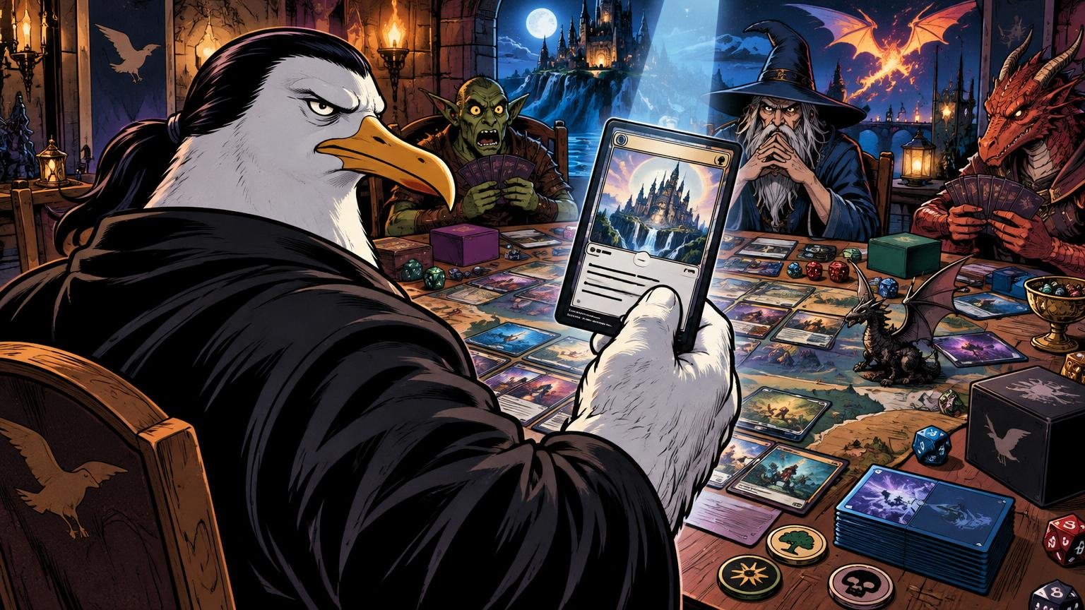
TLDR: If you want to know how to make MTG proxies readable, preserve a familiar information hierarchy, use plain high-contrast typography, keep art away from functional text, show important symbols clearly, and test a physical copy in its final sleeve. A beautiful proxy that requires interrogation from six inches away has failed the mission.
The correct standard is not whether a card looks sharp on your monitor. The correct standard is whether another player can identify it across a Commander table, understand what matters, and return to the game without borrowing binoculars. Learning how to make MTG proxies readable means designing for sleeves, ceiling lights, crowded battlefields, imperfect eyesight, and the brief glance players actually give unfamiliar cards.
Use the three-second battlefield test
Place the finished proxy on a normal battlefield and look at it from another player's seat. In roughly three seconds, that player should be able to locate the card name, mana cost, type line, major rules text, and any power, toughness, or loyalty value. They do not need to memorize the entire card from orbit. They do need to recognize what permanent entered and where to look for its operational details.
This is why screen-only design is dangerous. A zoomed-in image can make tiny text look elegant. A physical card under a reflective sleeve can turn the same text into classified material. Print one sample before producing a deck, cube, or playtest gauntlet.
- Check the card from the seat opposite you, not only from your own chair.
- Test it upright and tapped, because glare changes with angle.
- Place it among several other permanents instead of examining it in isolation.
- Ask another player to identify the name, card type, mana cost, and key ability.
- Repeat the test under the lighting where you normally play.
Build a ruthless information hierarchy
A functional proxy should tell the eye where to go. Keep the name and mana cost at the top, the type line in its expected position, rules text in a dedicated panel, and combat or loyalty values at the bottom. Familiar placement reduces search time even when the art and frame are completely custom.
My preferred priority order is simple: card name, mana cost, type line, functional rules text, power and toughness or loyalty, and then collector-style details. Flavor text, decorative borders, artist credits, set symbols, and cinematic smoke can survive only if they do not obstruct those items. The smoke does not resolve the trigger. The rules text does.
For more elaborate layouts, custom proxy art that stays easy to recognize should treat the frame as navigation rather than decoration. Use one stable information map across the deck. Moving the mana cost on one card, hiding the type line on another, and rotating the name on a third creates a tiny cardboard obstacle course.
Protect the rules text before protecting the art
Use a plain, open body font. Avoid decorative faces, narrow condensed lettering, excessive italics, and text placed directly over detailed art. There is no universal minimum font size established by the supplied evidence because readability changes with the typeface, printer, contrast, sleeve, lighting, and reader. The physical sample is the final authority.
When the text box becomes crowded, do not keep shrinking the functional text until it resembles a treaty written by ants. Recover space in this order:
- Remove flavor text.
- Reduce decorative padding and oversized frame ornaments.
- Shorten unofficial reminder notes that are not necessary for play.
- Use the conventional rules-text area instead of a full-art layout.
- Verify that you are using current Oracle wording rather than copying an obsolete printing.
- If the card is still extremely dense, create a clearly labeled reference card only if your group accepts that arrangement.
Wizards identifies Gatherer as the official source for Oracle card text, and its updates demonstrate that official wording can change after a card has been printed. Check the current wording before final production rather than trusting the first image found online. Wizards’ Oracle change notes provide useful context for why this matters.
Do not casually rewrite abilities to make them fit. A shorter paraphrase may alter timing, targets, optional actions, intervening-if clauses, or zone changes. Commander already contains enough diplomatic incidents without a custom semicolon changing how a combo works.
Control contrast and the art crop
Small text needs a quiet background. Use an opaque or nearly opaque text panel, and keep bright highlights, faces, weapons, spell effects, and high-frequency texture out from behind the letters. If the art crop puts a white explosion behind white rules text, the explosion has won. Reposition the crop or strengthen the panel.
Web accessibility guidance offers a useful contrast check: WCAG uses a 4.5:1 contrast ratio for normal text and 3:1 for large text in its web-content framework. Those figures are not a certification standard for printed, sleeved cards. Ink, paper, finish, lighting, and reflections introduce different conditions. Use the guidance as a warning system, then confirm the result physically.
Avoid relying on subtle color differences alone. Pale gray text on slightly darker gray may look sophisticated on a calibrated display and then disappear under a game-store light. Dark text on a light panel or light text on a genuinely dark panel usually gives the eye a clearer separation. Reserve low-contrast treatments for nonessential decoration.
Keep frames consistent without making cards indistinguishable
Consistency means the same kinds of information stay in the same places. It does not mean every card should become an identical slab. Preserve useful distinctions among creatures, lands, artifacts, enchantments, planeswalkers, instants, and sorceries. Type-line labels should remain explicit even when the visual language is minimal.
A consistent proxy style can reduce confusion within a deck, and PrintMTG specifically recommends consistency to help avoid confusion and marked-card concerns. If you want a broader production workflow, the site’s MTG proxy printing template guide covers setup details beyond readability.
Be especially careful with alternate treatments of basic lands and frequently reused staples. If five different lands share the same dark frame and nearly identical abstract art, players must repeatedly read them instead of recognizing them. Give each card enough visual identity to survive a crowded board.
Show color identity and critical markers clearly
Frame color is a useful recognition cue, but it is not the complete definition of Commander color identity. Wizards explains that color identity accounts for mana symbols in a card’s mana cost and rules text, so a gold, blue, or colorless-looking frame cannot replace accurate symbols and wording. Wizards’ Commander format overview explains the format’s color-identity rule.
Preserve every game-relevant marker that helps players understand the card:
- Mana symbols in the cost and rules text
- The complete type line, including Legendary where applicable
- Power and toughness on creatures
- Starting loyalty and readable loyalty abilities on planeswalkers
- Color indicators when the card uses one
- Transform, modal, or double-faced-card cues
- Chapter, level, defense, stun, shield, or other mechanic-specific information when relevant
- A clear distinction between reminder text and functional rules text
Do not replace familiar mana or action symbols with ambiguous personal icons unless every player can decode them instantly. A Commander pod is not the place to unveil an experimental pictographic language. I have negotiated under worse conditions, but I did not enjoy it.
Let dense cards abandon full art with dignity
Full-art layouts work best when the card has little text and strong recognizable imagery. Dense cards need more discipline. Give them a larger conventional text panel, increase separation between abilities, and keep loyalty costs or chapter numbers visually attached to the correct text.
If a card contains multiple named abilities, choices, or modes, use spacing and restrained weight changes to separate them. Do not solve density by using several tiny columns unless the original structure clearly supports it. Narrow columns create more line breaks and can make already complicated text harder to scan.
A separate reference card can help with unusually complicated commanders or transformed faces, but it must be clearly associated with the battlefield card and accepted by the group. Discuss such arrangements alongside your normal Commander proxy etiquette before the game. Surprise reference materials have the same tactical appeal as surprise tax forms.
Respect bleed, trim, and the safe area
Bleed is artwork that extends beyond the intended cut line so small cutting variations do not expose an unprinted edge. The trim line is where the card is intended to be cut. The safe area sits inside that line and protects important content from being clipped.
These measurements depend on the printer and template. For its own workflow, PrintMTG describes a finished size of 2.5 by 3.5 inches and recommends 1/8 inch of bleed plus a 1/8 inch safe margin. It also warns that cut drift can expose white edges or clip important elements. Treat those as PrintMTG workflow specifications, not universal measurements for every printer.
Keep names, mana symbols, type lines, rules text, and power or loyalty information inside your chosen printer’s current safe area. Extend background art into the bleed. Never place a vital symbol on the trim line and hope the cutting machine respects its rank.
If you move from home prototypes to professionally produced cards, custom MTG proxy printing is one route for turning finished files into physical copies; PrintMTG is part of this publisher’s network. Whichever printer you choose, download its current template and check its file requirements before building the final layout.
Test sleeves, finish, and glare as one system
Readability can change after sleeving. A glossy surface may reflect an overhead light directly across the name or text box, while a dark sleeve can alter the perceived brightness around the card. The effect depends on the particular sleeve, finish, room, and viewing angle, so product labels cannot replace a table test.
Non-glare sleeves are a real product category and may help when reflections are the main problem, although they can also change how crisp or saturated a card appears. Test one completed card in the exact sleeve you intend to use before committing the entire deck.
- Check the card under direct overhead lighting and softer side lighting.
- Tilt it through the angles commonly created when cards are tapped.
- Compare the proxy with neighboring cards in the same sleeves.
- Confirm that the sleeve back is opaque enough if the proxy back differs from surrounding cards.
- Ask a player with different eyesight to perform the recognition test.
Run the final multiplayer-distance drill
Shuffle several finished proxies into the deck, establish a realistic battlefield, and hand the operation to another player. Ask that player to find a specific permanent, identify its mana value and type, locate the relevant ability, and distinguish it from nearby cards. Do not coach. Silent observation is brutal and useful.
If the player repeatedly brings the card closer, the problem may be text size, contrast, glare, unfamiliar placement, or excessive rules density. Change one variable and test again. If the player misidentifies cards from a distance, strengthen names, frame cues, art differentiation, or type-line visibility.
The objective is not to make every word readable from the other side of the room. The objective is fast recognition at table distance and comfortable reading when a player picks up the card. That is a realistic standard. Helicopter-grade legibility remains optional.
Casual approval does not equal tournament legality
Always ask the playgroup, store, cube owner, or event organizer what it permits. Casual groups can establish their own expectations, but sanctioned Magic events use official tournament rules.
The Magic Tournament Rules dated February 27, 2026 state that cards used in sanctioned events must be genuine, regulation-sized Magic cards. Players cannot create their own tournament proxies; judge-issued proxies are restricted to specified situations. Read the official Magic Tournament Rules and confirm event requirements with the organizer before attending.
Extraction: clarity outranks spectacle
A successful proxy communicates before it performs. Keep the information map familiar, protect functional text, control the art crop, preserve symbols and card-type cues, respect the printer’s safe area, and test the finished card under real sleeves and lights.
Print one sample and conduct the three-second battlefield test. If another player can identify it quickly and read it comfortably, deploy the deck. If not, enlarge the text panel and reduce the decoration. Acceptable losses do not include the rules text.